Posts

Assignment 4

Image
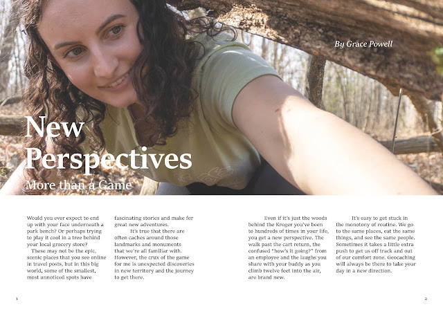
 Below are two spreads from the zine I'm working on as a final project for Graphic Design.  My zine is called "The Cacher" and is about one of my favorite hobbies, geocaching. This project would be the first "issue" of the magazine, so I'm making the content with that in mind. I want this to be an intro to the game for those  interested in trying it out for the first time, and give some more information on concepts that can be confusing.  In theory, going forward with other issues of this magazine, it would explore different types of caches, highlight fun finds in a "Cache of the Month" sort of feature, and talk about other parts of the game like trackables, and challenges.  After being involved for awhile, I'm always learning new things about the game and tips on how to do it better. A guide like this seems like something that would've been helpful for me and could be helpful for others too, as well as help foster a community. 

Drafts for Assignment 4

Image
Working on a zine about geocaching for our final project. Here are a couple of drafts for some of the interior pages.  

Grid System Reading Response

      This article  by Vera Fesianava really allowed me to notice how seamless and simple grids can make designs look. Looking at the pages of Svet Evangelia magazine, even when there are many different elements combining on a page, images, text, colors, titles, they feel organized and just as they should be.      Without a grid, if I tried to make something so complex but still readable, it would probably turn out like a chaotic mess that can't decide what's important and what should be taking up space or how things should be aligned.      When she introduced the 12 column grid, it seemed like the opportunities really opened up. Designing covers for our final zines, I used a grid, but only with a few defined rows and columns. This got me to a design that definitely made sense, but I think I could have played a little more using more lines on my grid.      I'm looking forward to working on the interior of my zine and ...

Event Posters

Image
 

Oscars Reading Response

     Benjamin Bannister's article about the typography mishap at the Oscars was very interesting and put what we're learning about in class in good context.      I had heard about that incident at the Oscars years ago, but never really looked into it. Reading about it now, it makes perfect sense that something like that happened with those card designs, and pretty funny that the Academy Awards don't have a better card design after so many years.      It crazy how unaware we can be of how our brain works, even though it works so nicely to pick out the important information on a page, card, etc. Turns out, designers have the hard job of organizing things to make it easy on our brains.     The Oscars is just one place where poor design can cause a major slip up. While that's a pretty big stage, announcing the wrong movie didn't get anyone killed. There are places where poor design could lead to much worse outcomes.    ...

GRIDS

Image
CMY Squares  Text Hierarchy

Two Draft Magazine Covers

Image