Posts

Assignment 4

Image
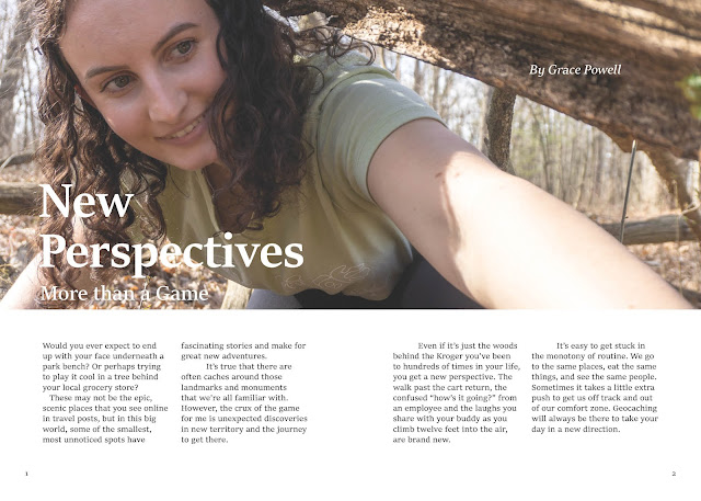
 Below are two spreads from the zine I'm working on as a final project for Graphic Design.  My zine is called "The Cacher" and is about one of my favorite hobbies, geocaching. This project would be the first "issue" of the magazine, so I'm making the content with that in mind. I want this to be an intro to the game for those  interested in trying it out for the first time, and give some more information on concepts that can be confusing.  In theory, going forward with other issues of this magazine, it would explore different types of caches, highlight fun finds in a "Cache of the Month" sort of feature, and talk about other parts of the game like trackables, and challenges.  After being involved for awhile, I'm always learning new things about the game and tips on how to do it better. A guide like this seems like something that would've been helpful for me and could be helpful for others too, as well as help foster a community. 

Drafts for Assignment 4

Image
Working on a zine about geocaching for our final project. Here are a couple of drafts for some of the interior pages.  

Grid System Reading Response

      This article  by Vera Fesianava really allowed me to notice how seamless and simple grids can make designs look. Looking at the pages of Svet Evangelia magazine, even when there are many different elements combining on a page, images, text, colors, titles, they feel organized and just as they should be.      Without a grid, if I tried to make something so complex but still readable, it would probably turn out like a chaotic mess that can't decide what's important and what should be taking up space or how things should be aligned.      When she introduced the 12 column grid, it seemed like the opportunities really opened up. Designing covers for our final zines, I used a grid, but only with a few defined rows and columns. This got me to a design that definitely made sense, but I think I could have played a little more using more lines on my grid.      I'm looking forward to working on the interior of my zine and ...

Event Posters

Image
 

Oscars Reading Response

     Benjamin Bannister's article about the typography mishap at the Oscars was very interesting and put what we're learning about in class in good context.      I had heard about that incident at the Oscars years ago, but never really looked into it. Reading about it now, it makes perfect sense that something like that happened with those card designs, and pretty funny that the Academy Awards don't have a better card design after so many years.      It crazy how unaware we can be of how our brain works, even though it works so nicely to pick out the important information on a page, card, etc. Turns out, designers have the hard job of organizing things to make it easy on our brains.     The Oscars is just one place where poor design can cause a major slip up. While that's a pretty big stage, announcing the wrong movie didn't get anyone killed. There are places where poor design could lead to much worse outcomes.    ...

GRIDS

Image
CMY Squares  Text Hierarchy

Two Draft Magazine Covers

Image
 

Layout idea sketches

Image
Some ideas for my final zine project, and a very bare-bones sketch of what one layout could potentially be. This example would have six pages without counting the front and back covers.   

Three Color Patterns

Image
 

Illustrator Practice

Image
 

Reading Response // How to choose a font

      While I know type is important, I haven't had to pay too much attention to it in the past, so it's interesting to hear of the objective and subjective qualities that typefaces can have.     I would have assumed legibility and readability were the same prior to reading this article. It makes sense now that a typeface could be legible by design, but placed and formatted in a way that gives it very low readability.      This article definitely made me feel like I need to do some solid research on my typeface choices before making decisions in the future. Factors like design intent, aesthetics, and mood make sense, and are things that I think we more naturally think about, whether or not the best decisions are made. However, prior to reading this, anachronisms aren't something I thought about a ton, but I see why it's important to avoid them.     Typeface isn't something that I've considered the history of much, but it makes sense that...

Adjective // Found Type

Image
  Art making has always challenged me to be more observant of the world around me, to tune into things I normally might ignore.  I thought my found type-face was a good representation of this as well, comprised mostly of things I noticed in my day-to-day life. So I chose to spell the word observant with those letters.  I kept the background flat so it wouldn't distract from the already busy variety of letters. 

Found Type Assignment

Image
      If you're paying attention, letters are everywhere. Using the world around me, with some rotation and cropping, I a was able to find the entire alphabet. 

Collage Letters

Image
 I created this first letter collage with a variety of images from a trip to New River Gorge this past fall.    This image was created with a group of photos from Christmas Day, 2022. We went down to the river to skate around for a little and took some fun pictures. Most of these limbs are mine, but my sister's leg makes an appearance from one of the photos where she was holding me.                     

Self Portrait

Image
          I lots of fun practicing with masks and other photoshop features to make an experimental self-portrait. I also tried to implement the figure-ground principle a bit, and saw how masking can play a nice part in working with positive and negative space. 

Figure Ground

Image
       Using masks on photos from our point, line, and plane exercise, I tried to create an image that called some attention to the figure/ground principle. Using a simple background and masking/coloring my original pictures so they weren't very recognizable were some things I did to call attention to the relationship between positive and negative space and how they interact. 

Text-based Art

Image
 "don't tell me where this is going. I loooo-ooooo-ooove surprises" Nora Turato      Siena - Jenny Holzer Philadelphia - Steve Powers References: https://mymodernmet.com/text-art-masters/ https://www.artshelp.com/theres-something-about-text-based-art/

Point, Line, Plane

Image
Point Manipulated To emphasize the "point" aspect of this photo, I first adjusted the hues and increased the saturation to abstract the area a bit. Then, I added some contrast by making the "darks" darker to make the individual dots of paint really stand out as "points" and so the center black splotch would be the first place your eye goes, as the main "point" of the image. Original Line Manipulated     To emphasize the lines in this photo, I first rotated and cropped the image into a square, so it would be less recognizable as just a rack of coat hangers. I changed the hues and increased saturation here as well as inverting it to further abstract. The goal was to allow the lines to be the main element, using them and the perspective to guide your eye straight back.  Original Plane Manipulated     The main change in this photo was flipping it upside down and cropping slightly to make a composition that really showcases the different planes visibl...

Transparency and Resolution Exercise

Image
 Transparency and Resolution The first image of three overlapping circles showcases the CMYK colors, which are subtractive. Therefore, adding them all together creates black, as seen in the center of their overlap. Using the screen blending mode in Photoshop, we are able to see how these colors interact.  This image does the same but with RGB colors that are on our screens. These are additive, so when added together, they create white.  This is the experimental image I created while playing around with layers and blending modes across them. I started with a photo I had of some old cigarette butts with cool shadows behind them and saw what I could do. I mostly added some different colored shapes and picked which blending mode I thought was coolest with it. Some of the modes featured are overlay, saturation, hue, and linear dodge. I then decided to mix in another photo to see what something with more variation and texture would do in these blending modes. I ended up with it...

Previous Work

Image
       Most of my artwork thus far is from the variety of classes I've taken in the Art, Film, and Communication departments. Last semester I was in an advanced photography course, Studio Lighting, and completed a ten piece portfolio.      Here are three of the ten photos from the final set. I set out to notice the old things in the world around us and how we deal with all of the stuff left behind from our rapidly developing technology. To find humor and irony in the tension between old and new, useful, and not and make photographs where this tension is the subject.  Tilted Gun Window Set Table          One semester I took a film course called Digital Cinema Production. We used Final Cut Pro and Apple Motion to animate a short video and produced the audio track in Garageband. It was one of the most challenging and time consuming projects I've done in school, but I was happy with the final result.       ...