Death of a Bachelor
I'm going back to my music-loving roots to talk about another music video. This one is to a song by one of my favorite bands, Panic! at the Disco. This video was directed by Mel Soria, who I recently found out directs videos for lots of awesome bands.
Compared to the rest of his work, this video is pretty tame and simplistic, not as flashy. But, I think the aesthetic appeal and composition of each shot is just gorgeous that it sucks you in and you can't stop watching.
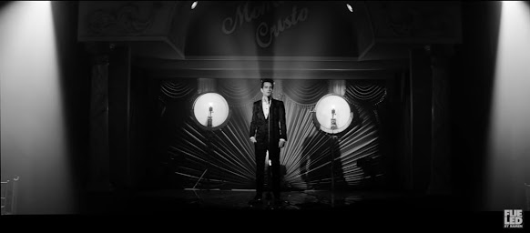
The first notable choice is that the video is in black and white. I don't think the video would be nearly as effective if it were in color. The black and white really emphasizes the lighting, creates a lot of contrast, and there's no color to distract from composition and the subject matter. Plus, it fits the speak-easy type vibe of the setting.
After introducing Brendon, the lead singer, sitting alone, drinking bourbon at a table, we see this shot of the stage as the song begins, which sets the scene for most of the video. This shot alone is certainly a work of art. The symmetry is striking for starters. This is when you can really see the value of the black and white in the lighting. The beams of light are part of the scene and highlight the empty tables . The lines from the fan shape of the backdrop along with the middle triangle of light guide your eye straight to the center where the microphone and it's shadow almost create a completely straight line through the center of the shot which actually makes it look almost like a mirror image. The shot is perfectly symmetrical except in the bottom left, you can barely see the silhouette of Brendon as he approaches the stage. This interruption of the symmetry instantly isolates him as he sticks out and doesn't have anyone opposite him to balance it out. As the song is called "Death of a Bachelor", this presents him as single, supposedly missing his "other half" and perhaps sticking out in the paired-up world around him.
The chandelier is also referenced a lot throughout the video. Each shot shows a different perspective of it, each capturing my eye. It almost appears to be a spider web or a ripple in the water.
The editing is what really makes a video oftentimes, and this one does a great job at moving things along/ not letting them get old, while also giving a clear story and not being too flashy. There is only one setting, which could easily get dry, but the director's ability to show the same objects from different perspectives and use editing to tell a story of one man in one room makes it engaging. I think this sameness also helps reinforce the themes of the song and the mundaneness and loneliness that we fear potentially experiencing without a partner.


Comments
Post a Comment