Posts

Showing posts from March, 2021

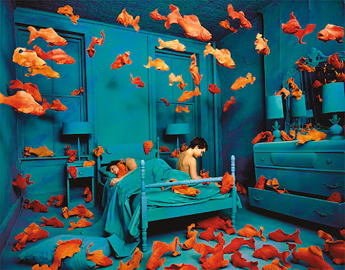
Sandy Skoglund - Art can be Accessible
Image
 Being in art classes again has been a major change for me, especially when it comes to describing and interpreting work. One artist I recently discovered, has made it easy, fun, and meaningful. This artist is American photographer Sandy Skoglund. She does some very large-scale work, designing and creating interior room sets with extravagant colors, and surreal scenes.  This is Revenge of the Goldfish, one of her most well-known pieces. I love her work because anyone can appreciate it, just out of the sheer impressiveness of what she is able to accomplish. She shoots these photos with an 8x10 camera an everything you see, the color, the contrast, the shadows, was done in-camera. Looking at this without assigning any deeper meaning to it is still an incredible visual experience and will certainly elicit some emotional response.  She uses complementary colors that vibrate with each other, and the fluidity of the clay fish makes it feel like this room is actually underwater.  While the vi

Caged In - My Video Mashup

Image
An artistic endeavor through the medium of video. That's what the goal was this week. This threw me for a bit of a loop because video is the medium I have tampered with the most, but always in more of a documentary manner, opposed to artistic. Not that documentary content isn't meaningful, but mine was always more just for fun, to document trips and experiences I have with my friends.  The most difficult part of this assignment for me was coming up with a theme, or a message that I wanted to convey with it. I've never really done this through video before, but once I got the idea, it was pretty smooth sailing.  I used some clips from those personal trips in my mashup as well as some from archive.org. I used visuals from a choir trip that someone filmed with a 35 mm camera while they were in college a while ago. I don't recall the exact year, but I liked that the older footage and fashion contrasted with the modern clips of my friends and some other people I found in the

What's it Called

I wrote a song!     Here you have it folks, click that link above and you can listen to my first song ever. I can't say it feels quite like I've produced an original music track, just because of how easy Soundation.com   made it.     I was super overwhelmed by all of the loop options there were and I couldn't figure out what genre I wanted to do, I didn't know what key I should put it in or what the bpm should be. After trying to be independent and ignoring the easy preset packages of sounds, I got frustrated and figured they were probably there for a reason.      So, I went over to the hip-hop starter kit and found a lot of stuff I really liked. Plus, most of it was in the key of Dm and 90 bpm so it cut down a lot of the decision making. Once I got that figured out I found a drum beat I liked and grew from there.      You can kind of hear my process in the song because I have most of the instruments come in one-by-one, and mostly in the order I chose them. Usually we

Everyone Deserves a Home

Image
  We made it. This poster took me hours, as expected, and I probably could have worked for hours more if I didn't stop myself. I'm pretty proud of what I was able to do my first time using Adobe Illustrator, but definitely need hours of more practice to get good at it. I'm sure there are easier ways to do some of the things I did and I probably over-complicated things like crazy, but that's all part of the learning experience. The more I added the more unmanageable it got, since I don't know all of the best ways to organize layers and to make sure I wasn't messing with something while working on something else. I did really enjoy this program and plan to practice with it more so it can be a skill I actually have.   I just hope that I did a good enough job to properly tell the story I was trying to. No one should have to live in a tent under an overpass. No one should have to worry about where they'll get their next meal. In this country, so many houses and b

Vector Learning Process

Image
  I've never used a vector  program before, and there is certainly a learning curve. Honestly, the closest thing I've done to this is using the paint a p plication on my Mom 's old deskto p back in the early 2 000s. I decided to take the slow and steady route to get comfortable with the program I am using, Adobe Illustrate. Above is an in-progress image of my vector poster, but getting to that point was not easy. I've been watching a video recommended by my professor ( https://www.youtube.com/watch?v=Ib8UBwu3yGA ) and learning the basics of the program. So far to show for it I have this penguin, that I traced from a different image as he walked me through, and we even added some shading and more detail. I think he 's pretty cute. Then I made this koala bear on my own accord, without tracing another image or following along to a video. I think I understand the basics of the  program, but still have a lot to learn. I think I 'm gras ping this program more than I

A Crisis we can't Ignore

Image
      How can one of the wealthiest countries in the world struggle to house so many of its citizens? How can so many pretend that the problem does not exist and that the  people on the streets are not there? And how is this problem not the number one priority of those in charge of our nation?      I know that there are an endless amount of  problems that our country faces today, but I certainly think getting everyone a place to live should be a good place to start.      Before we can solve the actual  problem, I think the stigma associated with homelessness must be eliminated. We are all human. We all have feelings. Bad things can happen to anyone. These are the people who need the most love. They should not be ignored.      Too often  people walk by those without homes without even acknowledging their existence. If we pretend these people aren't there or even resent them for "putting themselves in this situation'', we will never be able to fix the crisis that got the

Info about Infographics

Image
      H ere it is, my infographic about infographics. As soon as I read what we got to do for this assignment I thought it was pretty funny. But, it was also very informative and challenging. The pressure was really on to make this good, you can't make an infographic talking about infographics that looks bad!     I tried my best and am pretty happy with how it turned out, but starting from a completely blank page is quite overwhelming and intimidating on Piktochart. I knew that I wanted the color scheme to be orange and blue because one of the examples we looked at used them and I thought it really popped. This is because blue and orange are complementary colors on the color wheel.      Other than the colors, I got all of the information for this together before I started create it. I based my images off of key concepts. Right away I knew I was going to need a brain and an eye to convey the message of visual information being transmitted to the brain. I don't think I overloaded